Client
Stonal
Role
Lead Brand Designer
Date
2025
In mid-2024, I joined Stonal as their in-house brand designer. One of my first main missions was to update and scale up the brand, as the company had recently gone through a rebrand that including a new name and logo. The initial brand had been handled by a freelancer, and for various reasons the result delivered only a basic foundation, leaving the brand underdeveloped for a company in the process of scaling up.
As the sole brand designer on the team, I worked closely alongside the CMO. We officially launched the new branding in early January 2025 and the company website in October 2025. The new branding encompasses a brand development blueprint, brand assets including templates, illustrations, and motion graphics, a design system covering both marketing and product, and a fully fleshed-out brand guidelines document that lives and breathes with the team, continuously evolving to this day.
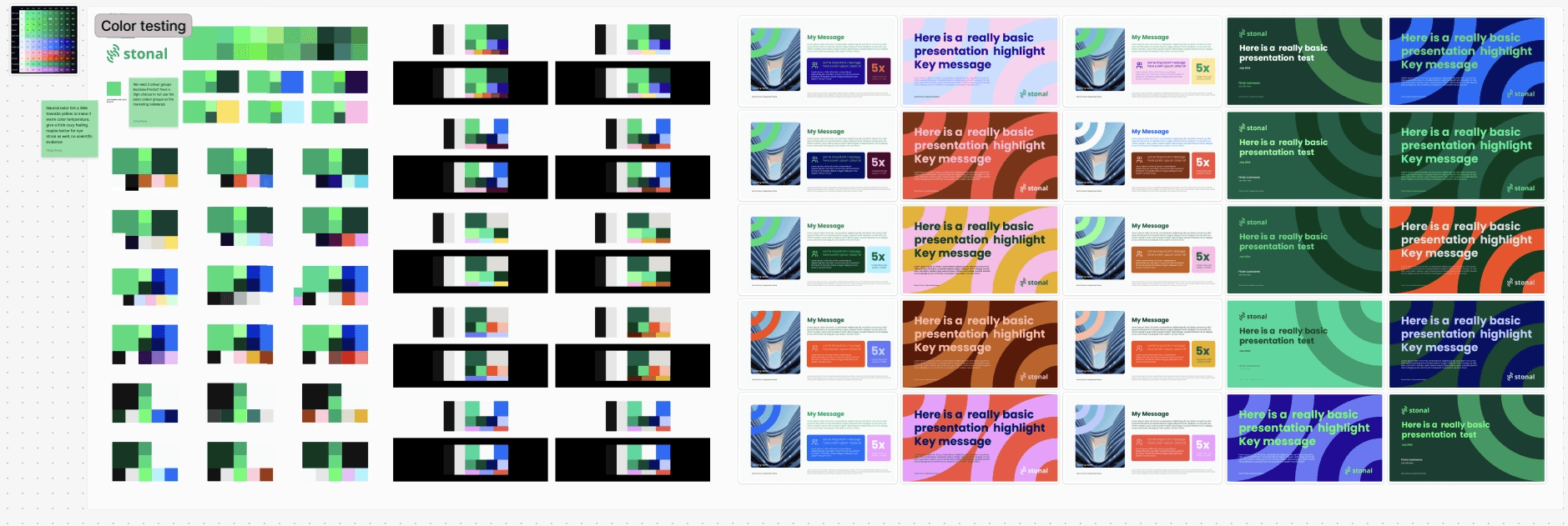

During the research phase, I conducted interviews across the company to understand how the brand was perceived internally, analyzed competitor and client brands, and identified key themes. The goal was to map the market landscape and define how we wanted to position Stonal. From this, I identified several major challenges to address immediately.
The brand lacked a mature colour system that could adapt across digital and print media.
There was a significant disconnect between the brand and the product — no shared visual language existed, and the product design system also needed a major overhaul.
There were no supporting assets, marketing collateral, or proper brand guidelines, leaving the identity underdeveloped and unable to stand out in the market.
The logomark and wordmark felt disconnected, with uneven proportions that created confusion internally and limited usage in certain contexts.


Through an iterative process of consistent communication and feedback, the proposal was approved and I moved into the delivery and production phase. Two important new additions to the brand were illustration and motion design.
I started with illustration. As Stonal is at the forefront of building data management, to put it simply, it connects document data with building plans and open data, this helps property managers make informed day-to-day decisions, so the concept of isometric illustration felt like a natural fit. It visually reflects the structured, data-driven nature of the product, is easy to replicate as the library grows, and adds a distinctive visual language across the brand.
Alongside illustration, I developed a foundational motion package for video communications, including lower thirds, an outro logo animation, and other essential assets.


The illustrations were very well received by the product team, which led me to develop the library further, including a loading animation. This collaboration with the product team eventually grew into a joint effort to build our design system, Moss.
Finally, I delivered a brand guidelines document of over 9,000 words, hosted in Notion. The choice of Notion was deliberate: its Markdown-based format is easy for AI agents to read and learn from. This allowed me to create a dedicated skill for our internal AI tool, Claude, helping colleagues produce on-brand documents (not perfect, but a meaningful time-saver) and support product development .
This was a major project involving multiple teams and stakeholders at every level of the company. It demonstrates the strength of an in-house team, one that can take a brand to the next level while bringing real value and tailoring every decision to the specific needs of the business.